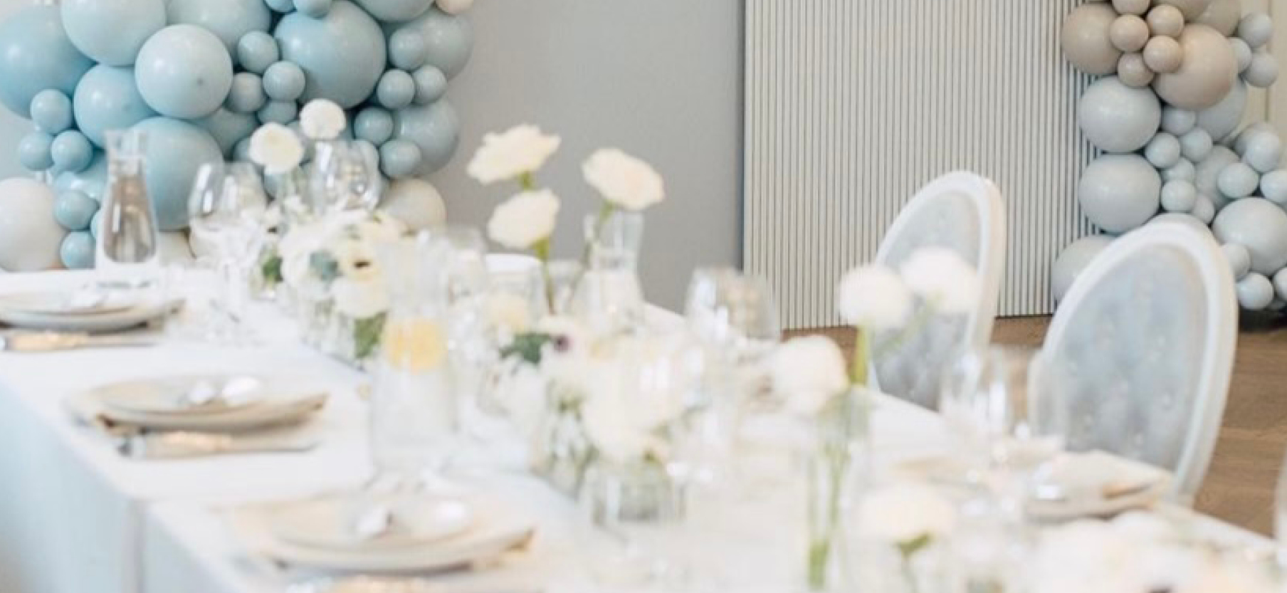
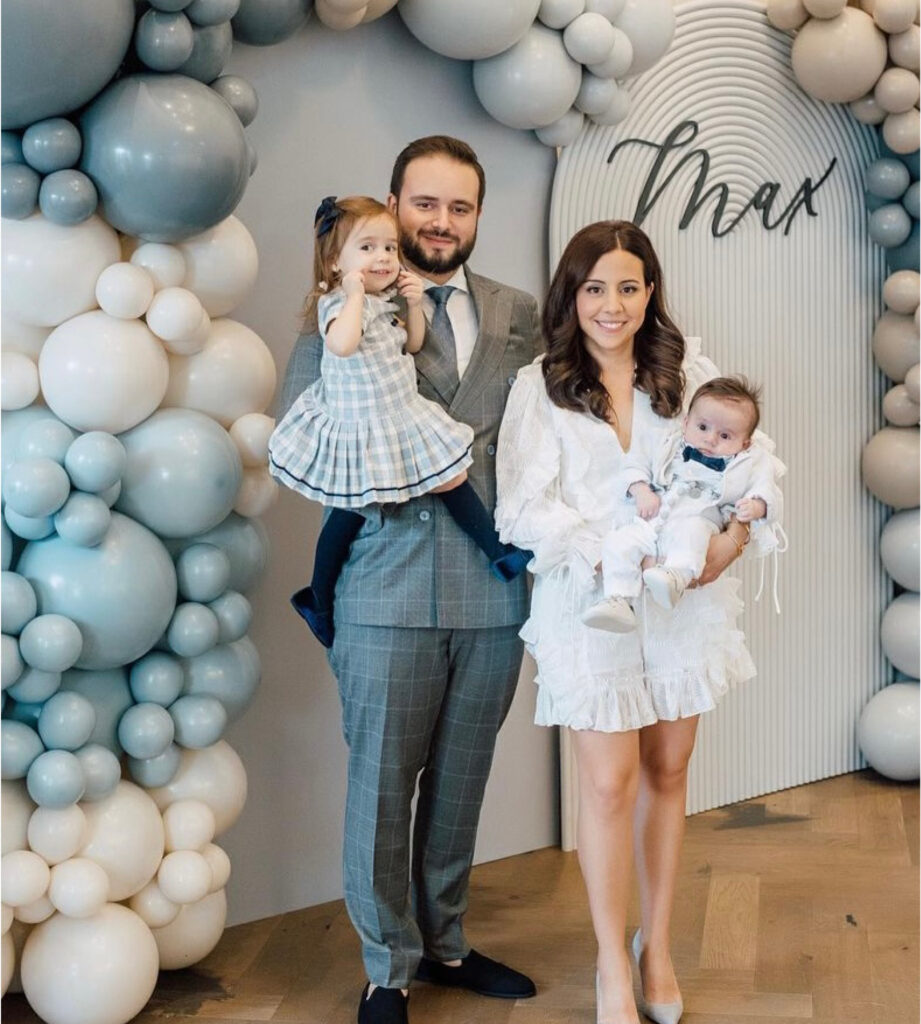
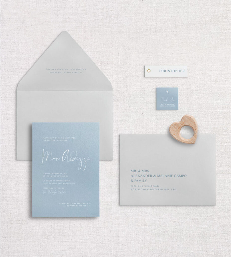
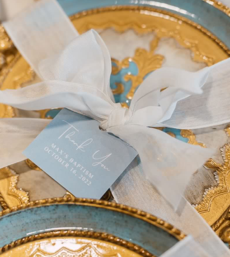
Last fall I had the honour of helping Amanda and her family bring their vision of their son’s baptism to life! Amanda reached out with some style inspirations, many which incorporated this dusty blue palette – which turned out to be the focus for all the stationery.
The venue was The Arlington Estate, hello dreamy. It could not be more magical. We wanted the stationery to be modern, clean and really just be a delicate detail to the day.
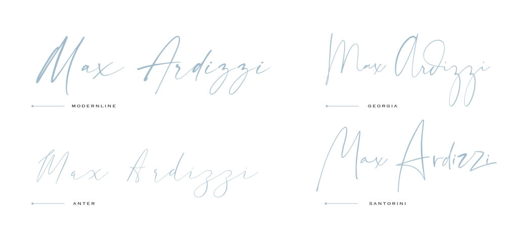
Finding the perfect font can be a challenge sometimes. Some of our favourite places to looks are on Creative Market, Font Squirrel and Dafont.com. Make sure you are looking for 100% free fonts or purchasing the correct license to ensure you are using it properly! I always suggest typing a word or name in the sample field to make sure you like the way specific letters look. In this case ensuring we liked the way the letters x and z looked was very important as they were in his name! After going back and forth with font options, we finalized the perfect handwritten script font for their son Max’s name. (Scroll to the bottom for font details).
Next up was the colour palette for envelopes. We ended up going with a soft cloudy grey envelope with a euro flap, so that we could have the invitation be a flood of dusty blue. With a lighter envelope we were also able to do the addressing in a slightly smokier version on the blue which is exactly the look she was going for.
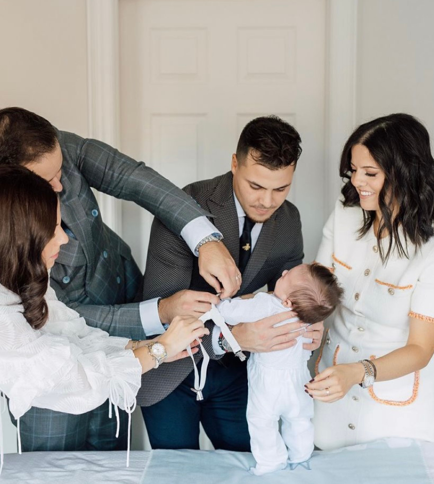
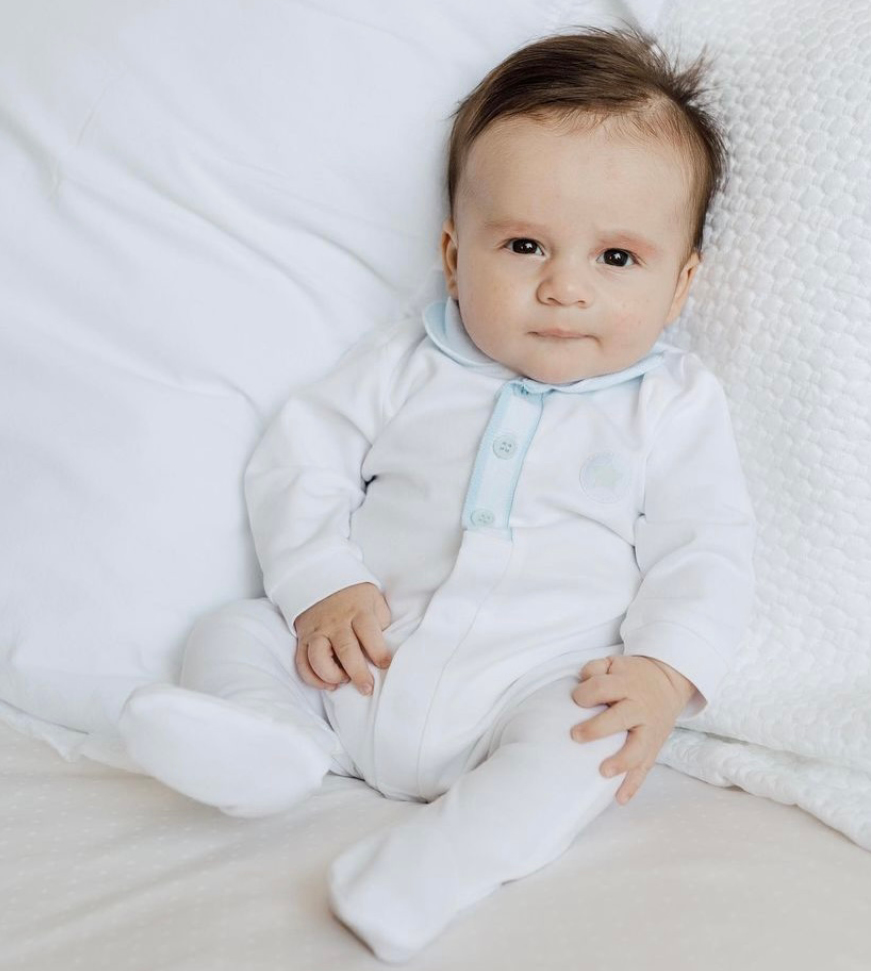
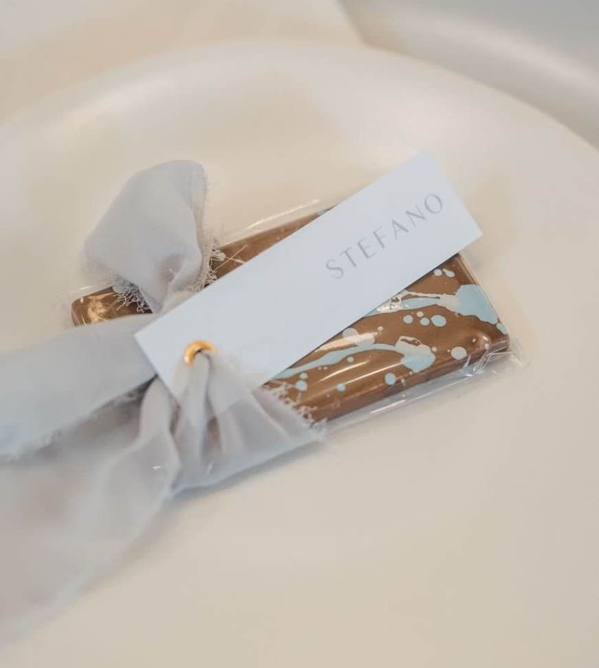
For the name tags, we added a simple gold grommet and used a raw silk ribbon to tie. Everything came together so nicely, the pictures were beautiful, and little Max could not have been cuter. Check out all the incredible vendors below! There is nothing I love more than being able to be part of your families special moments!
xo Alanda
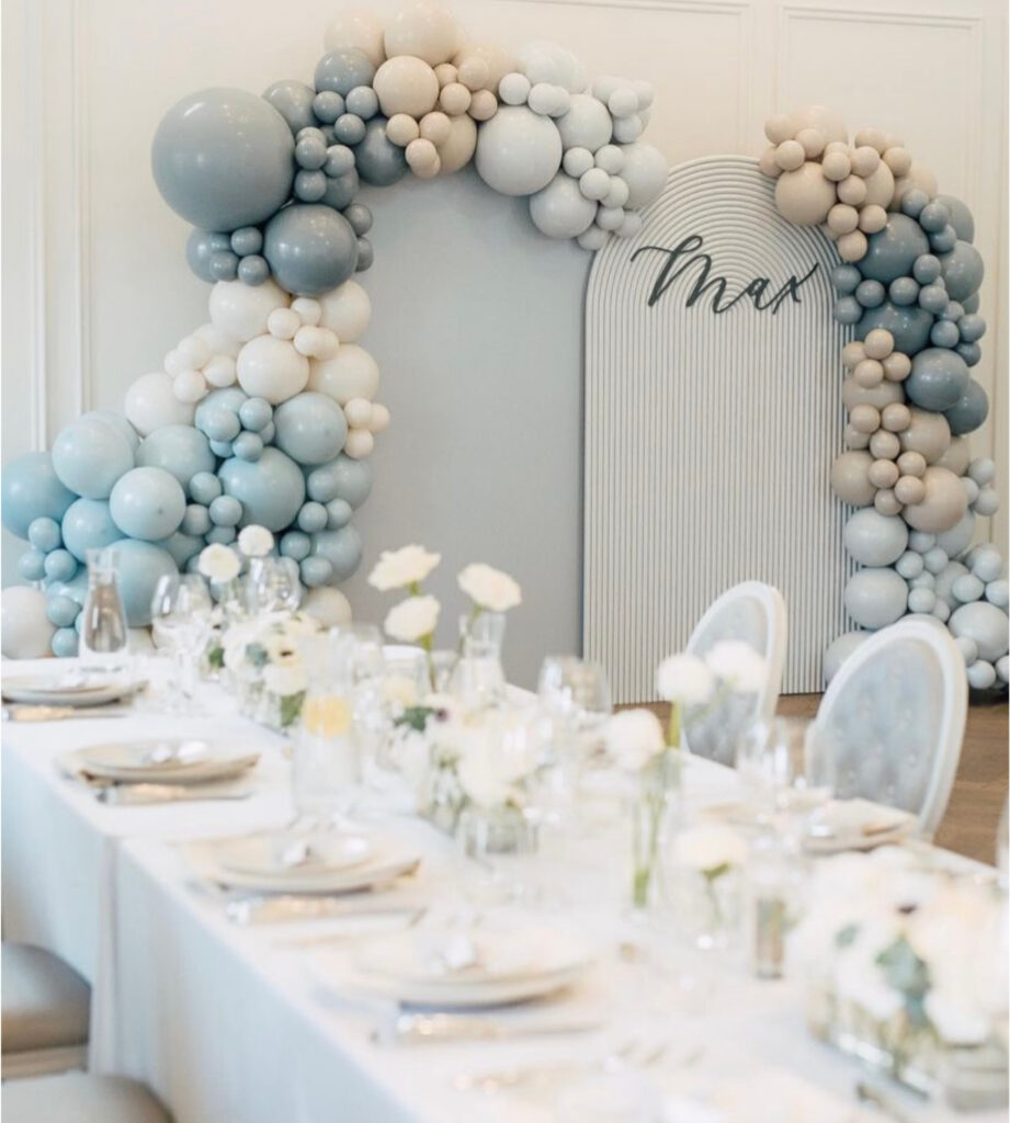
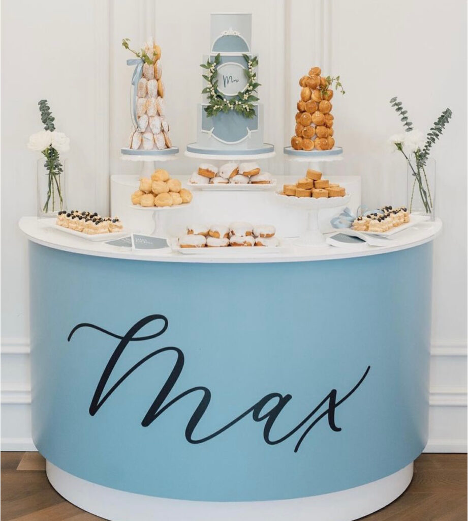
Vendors: Venue The Arlington Estate | Flowers Fiorissimi Floral Designs | Balloons The Sweetest Thing | Backdrop Decor and Fiesta | Cake Nadia & Co
Fonts: Georgia Creative Market
